Data Preparation
The project began by finding all the data on NFL player statistics that can possibly be found online and publically avaliable. Extensive, detailed, high-quality data on all NFL player statistics from 1970 to present was found on NFL.com. For older pre-Super Bowl Era statistics data, the website FootballDB.com provided just what this project needed. Note that the older back in time one looks, the more incomplete the data and record keeping becomes. Here are two small glimpses at the data found on the two websites:
NFL.com

FootballDB.com

Neither of these two websites has a publicly-accessible documented API for easy interaction. As a result, custom web-scraping tools were developed. FootballDB's scraper was fairly simple to design, as all the info on a given season is simply listed on the page in text form and can all be simultaneously seen when viewing the page source. The scraping for NFL.com was a far more difficult task, as the statistics are presented to the public only via a web-interactive table. It lists the top 25 players at first and the user of the website can scroll through all the rest, in successive batches, only by clicking the "next page" button on the interactive table to display the next 25. To perform this web scraping, one needs a far more advanced web scraping bot that can be designed using Python techniques from the module Selenium.
The following figure shows a quick glance at what the captured raw data originally looked like. This the head of the complete data set on Defensive player statistics for all NFL players in the year 2024.

Now, for comparison, this image has the same type of data but from the year 1940:

Note how many less types of data were being recorded at the time. Note how many incomplete entries there are. One of the great difficulties of this project was (and is!) deciding how best to integrate multiple quite-different data streams all into one cohesive and useful data cube.
The process of cleaning and merging the collected data was extensive, and a complete presentation of the entire pipeline would be well beyond the scope of this discussion. Numerous Python programs were developed to perform specialized tasks throughout the cleaning process, many of which were designed for a single purpose and then discarded once their task was complete. These programs were quite varied and included adding and removing columns, sorting entries, deleting entries, error identification and correction, missing data extrapolation, standardization, normalization, and various linear algebra processes.

Missing entries were handled. Row and columns were chopped, diced, and mixed together. One of the greatest difficulties encountered was sorting out a specific glitch that occurred when multiple players across history shared the exact same name. Finding those and separating them was quite technical.
The final data cubes no longer has original raw numbers that correspond to NFL player statistics. Each entry is now normalized, dividing by the stat score that the 7th best player got that year. This carefully chosen value serves as a kind of "median" of sorts, by which we can do percentiles.
Lastly, the data cube is "blended", using a moving average instead of a raw number for each individual year. This lets the process account for a player who might have been injured and out for one particular season.
This is a glimpse of the final data cube:

Exploratory Data Analysis
Now that the data has been cleaned, smoothed, merged, and is, at long last, complete, it is possible to begin exploring and analyzing the data! All of the various Python code files used to generate these information visualizations can be found on the project's GitHub repository:
https://github.com/orionhaunstrup/The_NFL_Project_MachineLearningClass
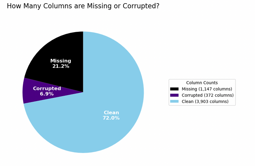
A natural first question concerns the overall quality of the collected data. What percentage of the dataset is complete and usable, and what percent is corrupted. What percent is simply flat-out missing? This analysis was performed at the column level, rather than at the individual-entry level, in order to avoid biasing the results towards seasons containing larger numbers of players due to either an increase in the number of NFL teams or due to new types of recorded statistics.
The next visualization examines the total amount of raw NFL data available for each season. For this analysis, every entry in the dataset was counted, no longer just one count per column. The resulting figure provides a useful overview of how much information is available across different eras of NFL history.

Several interesting patterns are visible in the figure. It's worthy of note, if unsurprising, that the total amount of recorded and stored NFL data has dramatically increased over the decades. The large jump-increase between 1969 and 1970 corresponds to the change in the datastream from FooballDB.com. to NFL.com. One unusual feature of this graph is the dramatic uptick in 1987 and the similar downtick in 1990. The cause of those two fluctuations is not at all clear and warrants further investigation and consideration. The 1990 season is notorious for containing a significant amount of corrupted and incomplete data. One might wonder what went so wrong in NFL statistics keeping in that particular year.
The next visualization examines a concept that lies at the heart of this project: the progression of player performance across an NFL career. To create this figure, 100 quarterbacks were randomly selected from throughout NFL history. On the x-axis is plotted how many years deep into their career they were, aka the players's career progression. On the y-axis is plotted "percentile score", a value corresponding to how highly they ranked among all the other quarterbacks of that same year. Each colored line represents the complete career trajectory of a single randomly selected quarterback.

One can immediately note that worse players tended to stay in the league for less time; many lines near the bottom end abruptly after only a few seasons. Many players lived their whole careers of as long as a decade somewhere near the bottom. Those may have been career backups or quarterbacks on weaker teams. One turquoise player was excellent early in his career, tanked badly around year 7, and then had an inspiring comeback and played the best of his life in year 10, shortly before retiring. Even just the graph of his career tells an interesting tale! And lastly, at the very top is one lone purple player who hit his stride in year 5 and then played at right near the top of the league for the next 14 years straight, never missing a beat.
Here is a similar analysis for NFL runningbacks:

With rushing, in the NFL, being so taxing on the body and so injury prone, it is of no great surprise the careers tend to be much shorter. Note also that many of the quarterbacks played until they were no longer playing well, whereas many of the runningbacks appear to return in full stride right in the middle of their careers. Hopefully this is not the result of injuries.
Next one could examine wide receivers, defense players, and kickers in a similar fashion:


Initial observations include the shocking fact that one kicker played for 25 seasons! This is just a randomly selected list of 100, so it is possible that the true longest a kicker was ever in the league for might be an even higher number.
One might wonder about the careers and stories of the two defensive players who seemingly rode the bench, each of them, for nearly a decade, before quite surprisingly having very late career major comebacks and becoming quite relevant again! Although one could say that after Philip Rivers's startling return to the NFL after many years's retirement last year, that the story of the above two defensive players should seem less surprising.
Most pertinent to this project is the fact that no discernible clear shape or pattern emerges across all of the various careers. There appears to be a good deal of randomness and or static to the ups and downs. This gives a good visual demonstration of how difficult a job it will be to accurately predict the remainder of a player's career, given limited early career info.
The next set of visualizations represents a transition from simple exploratory analysis to a lighthearted science experiment. Before examining the results, specific hypotheses will be proposed and then tested against the data.
Four variable pairs were selected for study: (1) quarterback passing yards verses percentile score, (2) running back rushing yards vs percentile score, (3) quarterback interceptions vs percentile score, (4) running back fumbles verses percentile score. For the first two pairs, the hypothesis is straightforward: passing yards and rushing yards should exhibit a strong positive correlation with percentile scores. This is simple, logical, and makes sense.
The latter two variables are more interesting and less obvious. Upon first consideration one might think that interceptions and fumbles should be strongly negatively correlated with percentile score, since both represent key mistakes that often lose football games for one's whole team. Upon closer examination, however, an alterative competing hypothesis comes into view. Players who accumulate large numbers of interceptions or fumbles must also receive a considerable number of starts and play for substantial time per season. Could these two negative features actually have a positive correlation with a player's percentile score? This will be the hypothesis for the moment — one of mild positive correlation.
The visualizations below will be used to test these hypotheses.


So far, so good. Nothing unexpected. Both (1) and (2) demonstrate the very strong statistical positive correlation that was hypothesized. Now is the critical part. Do (3) and (4) demonstrate the counter-intuitive mild positive correlation that was predicted?
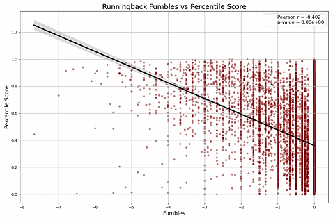

Partially correct. The correlation is indeed positive, but strongly so, not mildly. It does not immediately look like positive correlation when gazing at the above graphs, but one must recall that the # of interceptions and # of fumbles, after being normalized within the construction of the data cube, is being measured negatively. More fumbles means a deeper, more-negative number. We see in both charts (especially even moreso for quarterbacks) that the players with the absolute most of these terrible game-losing statistics have very good or at least reasonble player percentile scores. Perhaps this is due to players like Brett Farve, who legendarily threw the most touchdowns and the most interceptions year after year, while being an amazing player the whole time.
A very interesting small science experiment complete.
Next up, one could look at the relative rate at which different players of different positions deteriorate and drop out of the NFL. This might well be done using a side-by-side violin plot.

This graph, while interesting, is also somewhat frustrating. Quite surprisingly, this graph has proven quite essential to the project, but for all the wrong reasons. It has identified at least one player who played some type of Defensive position... for over 50 consecutive years? In the NFL? That surely means that the algorithm designed to catch players who share the same name and separate them into their correct separate careers is failing to catch them all.
While not at all the intended use of this graph, this might actually prove to be the most important info visualization of the night, as this project is all hinged on the accuracy of the data and the data cleaning and merging techniques. Clearly there is more important work and refining yet to be done.
This final visualization is less an exercise in science than an embracing of football's mystical, spiritual side. This graph has taken the above "career gatherer" Python code (which gathered 100 random careers for close, detailed scrutiny), and set it to instead gather and plot every career found within all 5 NFL data cubes. In so doing, the image becomes a portrait of football history itself. Every pass thrown under stadium lights, every touchdown run through falling snow, every championship celebration, every devastating injury, every dream realized, and every dream lost leaves its mark somewhere within the pattern. Individual players disappear into the whole, yet their stories remain. What emerges is not a chart, but a tapestry woven from decades of competition, sacrifice, triumph, heartbreak, and hope. The image contains the full history of the sport — not as statistics or records, but as a single living trace of the human stories that created them.
